Here Are The Top 10 Company’s Digital Marketing Logos & Their Meaning
1. Beats:

Beats
Looked at a glance the logo for Beats by Dre is pretty simple. The ‘b’ is enclosed in a circle followed by the brand name. The circle, though, isn’t just a circle. It actually represents a human’s head, and the ‘b’ letterform represents the brand’s headphones.
2. Cisco:

Cisco
The leading giants of computer networking and the worldwide leader of internet technologies are named after its headquarters’ location in San Francisco. Although its namesake doesn’t have a hidden meaning, the blue stripes above the logotype not only represent an electromagnet but also, the Golden Gate Bridge.
Thank you for reading this post, don't forget to subscribe!3. Baskin Robbins:

Baskin Robbins
The famous ice cream outlet that dish out some of the most amazing ice creams is known for its seemingly unlimited flavors. Although that is not the case as decipherable from the logo. That famous number is hidden in the ‘B’ and the ‘R’ of their logo, acting as the curve of the ‘B’ and the stem of the ‘R’. The logo represents fun and energy, much like how you’ll feel during (and after) eating their ice cream.
4. Vaio:

Vaio
Sony Vaio also is known as Visual Audio Intelligent Organiser, is known worldwide for its technology, but there is a catch in the logo. Vaio represents the integration of both analog and digital technologies in its products. The letters ‘va’ is made to look like an analog wave, while the ‘io’ resemble the numbers 1 and 0, representing a digital signal or binary code.
5. Picasa:

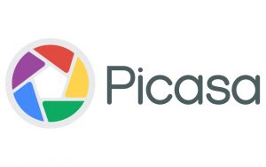
Picasa
Picasa, Google’s former image organizer, and editor have an interesting logo mark. At first glance, it looks like a simple camera shutter, but the negative space in the center of the shutter actually forms a house. This is because Picasa is considered ‘home’ for all of your photos, and casa in Spanish means home.
6. Le Tour De France:

Le Tour De France
Le Tour De France’s logo has two hidden messages inside of it. The first is a bit more obvious, with a cyclist making up the letter ‘r’, but the second is more subdued. Also, the yellow circle that acts as the bike’s wheel is also a sun, indicating that the events of the race only occur in the daytime.
7. Gamecube:

Gamecube
Nintendo Gamecube’s logo is very interesting to look at, and for good reason. Not only is it a cube within a cube, but the outer cube forms a ‘G’ around the inner cube, leaving a ‘C’ in the negative space.
8. LG:

LG
LG is famous for its technological prowess and the notable ‘L’ and ‘G’ in their logo but what people fail to realize is that those letters actually help to create a face. The ‘L’ makes the nose and the ‘G’ makes up the rest of the face. This gives the brand a human element and makes it more inviting and approachable.
9. Toblerone:

Toblerone
This is one of the most popular brands of chocolates and its current logo features a mountain. It symbolizes the Matterhorn Mountain in Switzerland. Hidden inside the mountain is a bear, symbolizing the unique honey flavor found in the chocolate. It is a fact that the chocolate is made in the ‘City of Bears’.
10. Audi:

Audi
The luxury car company based in Germany also has a hidden meaning in its logo. The four rings represent the four companies that came together to create the original Audi, Auto Union.
We would like to thank Digital Marketing Lead for providing the details, data & support for this article. The detailed information was provided on the basis of the advertisement & client management conducted by the Digital Marketing Lead for the year 2018-2019.


